In-class for Illustration we were tasked with drawing and practicing in applications to put towards our project and development as artists. The following are the first ones done, a variety of different orientations and sketches of ideas for Project 2.
Getting the right angle in these drawings to really show the feeling of the three pigs and the wolf were all very difficult, and in the end I went back to an earlier composition made in thumbnails.
The following was a simple expression exercise to further explore the facial expressions that the characters depicted would make in the final results, running through different facial expressions using simplified faces.
I remember doing these in Life Drawing for Animation and they're still fun to do; though I already had ideas for the facial expressions for each of my characters.
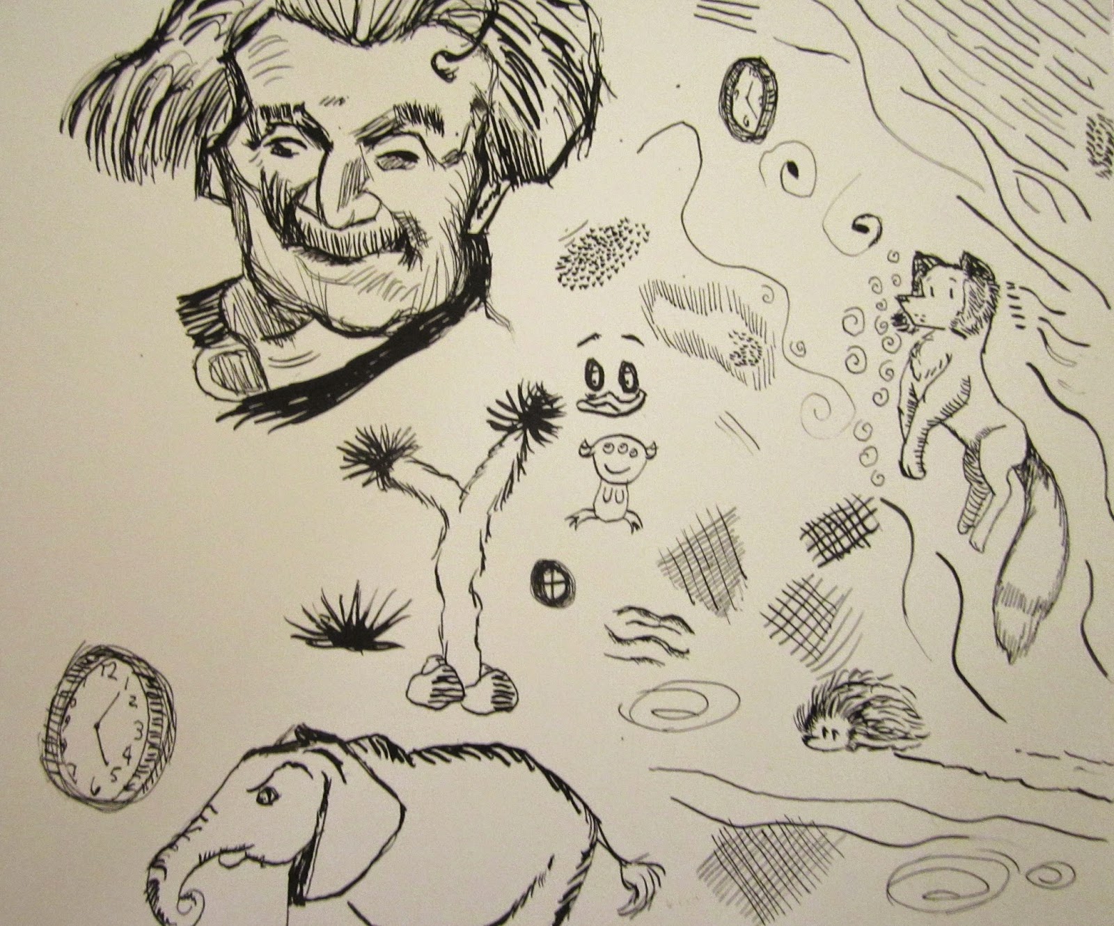
Finally, some in-class sketches I did later in the semester were for Project 4, following critiques about my ideas for the illustration.
This is pretty helpful with roughing out ideas or finding them, especially for the last page.
Friday, November 21, 2014
Illustration A: WDP #6: Value and Color Studies Project 2
For Project 2 I had three color and value studies I needed to do. I'm not too familiar with color, the concentration of my animation courses rarely touches on it, but I was very comfortable with the value experiments!
From top to bottom: Light characters and dark background, dark characters and light background, and high contrast rendering.
I felt like I preferred the middle and even used it for the final basis of my project, but I was a bit fond of the high contrast if only due to the fact that it made the pigs look all the more menacing.
With the colors I really struggle with it, I don't use color at all typically. I do really like how the wolf came out in the top image, the analogous colors test using shades of reds and blues/purples. I feel I need to revisit this option for a redo of the project, as it has something to it with the warm interior and cold exterior of the brick house.
Illustration A: WDP #5: Sculpey References
For my narrative illustration I was tasked with making clay representations of my characters shown in the piece. The story was about inverting the roles of antagonist and protagonist, making the three pigs cruel and the wolf in need.
I love playing with clay, and specifically wi
th this sculpture of the wolf head I was able to determine how the ears were supposed to lay on the angle I wanted to draw from! Super useful!
Pictured: Some drawings I did using these references:
Thursday, November 13, 2014
Thursday, October 23, 2014
Sculpture WIP: Pabu!
Working hard on my second sculpture project, Pabu from Legend of Korra!
Here's the reference images I pulled online to sculpt him, hope he turns out as cute as he looks in the 2D plane!
Tuesday, October 14, 2014
Illustration B: PaperCraft Marvel Kitty
The second project for my digital illustration class was making a Hello Kitty and changing her to represent a Marvel character. I chose Doc Ock because he has cool tentacle arms and he was my favorite Spiderman villain.
Sculpture: First Project
This project entailed recreating an existing 2D character by using their turnaround to create an armature and sculpture of their form. I chose Varrick from Legend of Korra!
Wednesday, September 24, 2014
PMC Drawing Challenge Entry: A Night Fury Ate My Homework
Since I'm a member of the PMC (Pencil Mileage Club) on campus, one of the monthly events held is a drawing challenge for all PMC members. This month was 'X Ate My Homework'.
I was tempted to do the 'I accidentially ate my own homework' but couldn't really work it. Then after it was announced the How To Train Your Dragon 2 Artbook would be one of the prizes, I started doodling Toothless for fun. After a while I ditched my first idea and went with Toothless shredding a priceless project the day this event was due.
This was done in a combination of a 4B pencil, Micron Pens and three Tombo Markers.
Tuesday, September 23, 2014
Illustration A: Media Sampler Panel #1
My first project is 1/9th complete!
The first I did was a time-consuming papercut illustration featuring an elephant flying with a clock in a satchel around its neck. I figured the papercut look would lend itself well to this Dumbo themed illustration and I think I was right!
Illustration A: WDP #4
This week our task was to paint with opaque acrylic compared to the previous week with a more transparent layering style. Painting opaquely I thought was slightly easier than transparent due to its similarity to painting in oils, which I have used before.
Through this process I learned how to make a soft gradient, as my changes in color had often had a hard edge instead of a soft edge when I painted.
Wednesday, September 17, 2014
Illustration B: Splatter Portrait
Today I think I've finalized my splatter portrait! This will likely be the version which will be printed out and mounted for next week as a grade. So exciting!
I personally think this is a mixture of Sin City and Hellsing styles of art but that could just be the sketchy look.
Tuesday, September 16, 2014
Illustration A: WDP #3
This past week we've been studying and practicing how to use acrylic washes to make gradients and how to make hard or soft edges.
I never actually painted with washes; all of my earlier classes involving painting were done in opaque oils where setting down color was the first and only priority. I do like the technique even if the process requires starts and stops for the water to dry, and I think after some trial and failure I'm getting the hang of painting this way!
Monday, September 8, 2014
Illustration A: WDP #2
My second entry for my drawing and painting assignment is about our ink lessons from the previous class.
To be honest I never particularly liked pen and nib inking. This was because I didn't have a teacher who took the time to explain out how this tool worked and the many different things an artist could do with it. Anything I made with ink I was either ashamed of or frustrated with and tended to use microns in my 'ink' work (as seen in my animal drawings below). Though, even then, ink confounded me terribly and I still wasn't fond about it.
After this lesson I felt far more confident with a pen and nib than I had before. Testing out the different nibs felt freeing instead of stressful and I found I enjoyed the bolder sketchier look of the larger nibs as much as the very delicate smaller nibs used for the finer details in the sketches above. There's something wonderfully charismatic and confident about these marks, along with the way they can vary in line density and line boldness.
Monday, September 1, 2014
Illustration A: WDP #1
An assignment for my current Illustration Class is to post weekly drawings that the student as done in addition to some commentary on what was learned through the exercise. This week: the basics!
During the first day of class we had a challenge sprung on us; to draw ten of the following:
Cubes, Cylinders, Cones, and Spheres
The catch was that we needed to draw each in ten different points of view in twenty minutes! I barely was able to finish my page but I'm glad to say I managed it.
On Thursday our task was to refine our skills at drawing the basic shapes and to learn new methods of rendering accurate images.
I always have a bit of a problem with ellipses, the ends usually turn out somewhat tapered and football like. Hala taught us a useful method of drawing them, and cylinders, by paying attention to the lengths of the longer ends of the ellipse to the shorter ones. It was informative and helped me with my homework assignment, where I needed to handle a fair amount of ellipses with my object.
Saturday, August 30, 2014
Animal Art #3
These are from my Animal and Wildlife Drawing class from Spring 2014. They were part of a materials project I was tasked to do.
Life Drawing #2
These were from my most recent Life Drawing classes last semester (Spring 2014). Towards the end of the semester we were to use better paper and either pastels or charcoal.
Illustration B Preliminary
The first project of the semester for my illustration class is to make 'splatter art' portraits. This post is more for my personal backup and reference in case something happens to the original image.
Friday, August 29, 2014
Animated Film Blog
Here's a link to the blog I had for my first Production class, and some preproduction work I had done between 2013-2014. It's a film about a baby shark that loses its tooth!
Wednesday, August 27, 2014
Animal Art #2
This was one of my projects for Animal and Wildlife in Spring 2014, where we needed to design a re-imagined mythological creature while maintaining believable anatomy and motion the proposed creature maintained in gestural drawings.
My thought was a cat-sized exotic griffin that lived in the rainforest and hunted small prey. The legs were switched to allow optimal movement for the animal through the dense foliage of the rainforest as well as a capability of flight.
Subscribe to:
Posts (Atom)